|
|
Post by ashrothedm on Jul 10, 2013 21:31:14 GMT -5
Something didn't sit right with the 2.5D forests, so this is a very quick experiment trying a few variations on trees. The paint is still wet, and this is a roughly 15 minute endeavor, so keep that in mind when I mention what I am trying. Firstly, what I don't like about the current forest implementations, is that while tall trees look cool, they are a bit of a pain to play around, especially in heavily forested areas. Secondly, they don't store as nicely as flat tiles. Most tree materials get beaten up after heavy use, they can fall apart or require maintenance. They are just not flat. And, while it is a nice 2.5D usage, I feel like most of the trees just give the strange impression that you are upside down. Below I have 2 images with 2 trees each (very rough) that I want to show and workshop 2.5D tree/forest ideas. Common to all of the tiles are the trunks. After doing some math, looking through forestry surveys and statistics, and more boring math bits, I came to the following conclusions. Trees to scale should be 3/4" or less, most averaging around 1/2" or 1cm. To scale, that's about what a tree trunk should be. They can be smaller, and in a fantasy world, sometimes a lot bigger. But, realistic trees, 1/4" - 3/4", with most in the middle at 1/2" diameter. Below is not an example of spacing, but spacing varies greatly by forest density. In the end, a dense forest is about 20' between large trees (with a ton of little junk in the middle) and a loose forest is around 60' between the large trees. that's randomly 2"-12", but the average was around 2"-4" With the math out of the way, I knew I had my spacing at roughly 2" for the big trees, with a typical diameter of 1/2". In considering 2.5D, I was looking at battle maps and how a forest map is used. Without software, minis just stand on the branches, which is not what I want. If the leaves were just part of the tile, they would look like they were standing on flat trees, and I'd never see the trunk. So I started thinking about what it would be like from a mini's perspective when it occurred to me: Shadows. Shadows are what tell you that you are under a tree, without seeing the tops. The thought is, make the base tile whatever the terrain actually is, and then water down some black paint and stipple on the shadow of the trees above. Clearings and the shade of the canopy is clear. So, now to the specifics below:  Tree A: Torn cardstock giving a rough edge painted a solid green, stippled black. Pro - gives a little dimension to the base. Con - Looks like the tree is upside down. Trunk is (quickly) painted like a cross section, which makes it seem like the tree has been chopped down and is just standing on its head Tree B: Cut Cardstock. Same as A, except the top of the tree is black. Better in my opinion, as it seems like it is impassible, which it should be. (You can really only see the stippling on the edge a little. Paintjobs are not complete)  Tree Tree C: Normal ground, stippled with shadow. I like this direction. Tree D: Leaves defined with sand/flock, painted (still very wet) The top half is just the outline flocked. So, briefly my conclusions from the test here: I believe the optimal process is as follows: - Glue the tree trunks to the tile (in my case 3/8" - 3/4" dowel sections about 1 cm or so tall)
- Add hot glue roots to make them less cylindrical
- Base coat black
- Spray brown stone texture spray paint on the tile (This step has been omitted, so you'll need to imagine it)
- Drybrush some greens throughout the brown. (or color as desired)
- Paint the tree trunks individually, then top the cylinder with solid black.
- Wet down some black paint and stipple the shadows of the leaves
I believe the major improvement is the covering of texture paint, as it will bring out a little more depth in the forest floor.
Again, please excuse the 15 minute slap-paint method of running this experiment. This is the beta test before I make some tiles.
Of course, using lichen or sponge bits for the other plant and shrub growth is still valid, but the goal here is to observe a 2.5D height restriction of not more than a few centimeters. Playability is important, as well as durability and flexibility.
Post up any ideas you may have, provide some feedback, and workshop this problem out!
|
|
|
|
Post by bloodchoke on Jul 10, 2013 23:04:44 GMT -5
I like it. Simple and elegant solution. You're right about the tall trees, they definitely get in the way of game play.
|
|
thedmg
Room Planner

Posts: 327
|
Post by thedmg on Jul 11, 2013 14:01:54 GMT -5
I also came up with the shadow/stump method. I have not done a prototype yet so you beat me to it  . I have been busy on my cave tile system and have not gone to wilderness yet. It works well. I was thinking of placeable/removable branch platforms that could go on top of the stumps for minis up the tree. Kind of like a 3d chess board. I was also thinking that a large tree should be on a 2x2 6.5cm base and be at different levels to similuate undulating terrain. Smaller trees as placeable terrain pieces on 4.5cm cardstock bases (not there yet in the videos) for rapid deployment. |
|
thedmg
Room Planner
Posts: 327
|
Post by thedmg on Jul 11, 2013 14:03:51 GMT -5
I was going to use cardboard tubes for the stumps and leave the centre hollow, but painted black.
|
|
|
|
Post by ashrothedm on Jul 11, 2013 15:35:09 GMT -5
My thoughts for branches, or being in the tree, was going to be to convert the flying bases (clear plastic base and a clear vertical post) into the branch bases. Putting a small flat card or washer on top of the clear plastic post, with some lichen or twigs around it, and the mini would look like it has been elevated into a tree. (Probably several at varied heights)
After I pick up some brown stone texture paint, I'm going to try a small forest tile with the method I listed above. With dry paint, the prototype tile looks better, and the shadow is nice.
I also think letting the forest floor set up the mood will help on the forest tiles. If you have 3d tree, the mood seems similar when it is used. If the tree is colored like it is a bright sunny day, it looks out of place in a gloomy forest. I was thinking of doing a small clearing as the first forest tile so that I can experiment with the lighting and shadow. Stippling black for the shadow, and dry-brushing some yellow/gold into the clearing might give the impression that there are run says poking through the tree tops.
I do not have any cardboard tubes small enough for the trees, or that would be a good substitute. I may try with small branches clipped to under 2 cm, but with the glue required for the roots, it doesn't seem like the payoff would be that great with so little of the original branch exposed.
I'll post up a finished tile, prototype 2, when I finish it, but if anyone else has any comments, observations, or ideas, I'd love to hear it.
One note for the forest tiles is that I think I am going to use bits of sponge for my undergrowth rather than lichen. The main goal: durability. Shawn Morris uses glue, water, dish soap, and clump foliage to make smoke markers in this video:
and I think that similarly hard foliage-like plants are better for reuse. I plan on stacking these tiles in a box, transporting them, and beating them up. Sponges are cheap, and they should look just fine in that regard (painted obviously).
|
|
|
|
Post by ashrothedm on Jul 11, 2013 16:16:28 GMT -5
Below is a quick reference of some typical tree widths from various species of trees. If they grow out in the open, this is how wide they can get, and what that means to scale down to 1" = 5'. To get that wide, they need enough spacing to grow to full height, so expect this to be the distance between tree trunks that grow that large. Forest density matters of course, but tall trees need room to grow. To keep the tile interesting, I'll be using a minimum of 5 cm spacing between tree trunks. (for the big trees) | Tree | Width | scale cm | scale in | | Almond | 10' | 5.08 cm | 2.0 in | | Maple | 30' | 15.24 cm | 6.0 in | | Fir | 50' | 25.4 cm | 10.0 in | | Oak | 100' | 50.8 cm | 20.0 in |
I am also looking for the tiles to be modular for each tile set, so I was thinking that for my 6.5 cm sections (using thedmg's method of sizing, dm scotty's painting) I will have the full 6.5 cm edge either under shadow or open. That way, I can transition between forested and un-forested tiles. That also means, that no trunk will be within 2.5 cm of the edge of the tile. Using this additional constraint (rather than walls) I think there will be an interesting mix of tiles needed for a full set. (I still have not planned that part out, so I have no idea what those numbers will be.) |
|
thedmg
Room Planner
Posts: 327
|
Post by thedmg on Jul 12, 2013 9:00:06 GMT -5
Can't wait to see images...
|
|
|
|
Post by ashrothedm on Jul 12, 2013 14:40:48 GMT -5
The moderately well planned out first tiles should be available this weekend.
|
|
thedmg
Room Planner
Posts: 327
|
Post by thedmg on Jul 12, 2013 23:57:17 GMT -5
I am in Australia so the weekend ends sooner...
|
|
caveman
Paint Manipulator

Posts: 107
|
Post by caveman on Jul 13, 2013 12:04:01 GMT -5
FWIW, I thought your method 'C' produced the best looking results, and that you are right with regard to shadows providing the clue that you're beneath a tree. I think the golden dappling to simulate sunlight streaming through has a lot of promise and I'm definitely waiting for the pics. Thanks for the stats on tree girth and spacing. I have to contend with tropical trees -- some of them giants-- in the Skull and Shackles AP, so I'm using DMScotty's techniques for "dead gnarly trees" (episode 48), and am going to paint them as live trees. I ran into the cramped spacing issue on my Man's Promise ship model, and I appreciated you mentioning how it happened to you when using full 3D trees. I think what I'll do is use fewer trees and ask the players to imagine the rest...
Anyway, I think your method 'C' looked the best. Thanks for the tip!
|
|
|
|
Post by ashrothedm on Jul 14, 2013 16:26:41 GMT -5
The following are the first set of Beta Tiles using the method above: (Camera work sucks, but the tile is there) Looking for thoughts on improvements, adjustments, general feedback, etc. Overall, I think the tiles will work our well. With modular forest tiles, I will be able to blend them seamlessly with the dungeon tiles. All four modular tiles (One pizza lid worth)  Ranger on a Tile  Ranger on a tile closer view:  Ranger 2 on a tile:  |
|
|
|
Post by ashrothedm on Jul 14, 2013 16:33:03 GMT -5
My thoughts:
I should have had the gold paint a little bit thinner.
Instead of the brown texture paint, flocking the entire thing in a fine sand might have been better, but that effort might be undermining the simplicity.
Wisps are too long on the trunks.
|
|
thedmg
Room Planner
Posts: 327
|
Post by thedmg on Jul 14, 2013 17:43:50 GMT -5
This looks incredible, just how I envisioned doing it. Some minor points to help with modularity:
Dont end earth patches on the sides as they wont line up if the tiles are turned around.
If you do want them to go to the edge for a worn pathway, make sure it is always at the same point like the middle 6.5cm square on each side.
You can make separate road tiles, 6.5cm wide for straight roads, or the same 3x3 for curves.
13cm wide straight river/stream tiles.
You can also experiment with undulating terrain pieces with layers going up one and down one.
These will make great additions to your game for random wilderness encounters, planned encounters and for the surrounds of a village or town. The use of trees and rocks and a bit of shrubbery makes this a great set for strategic tactical combat.
Bravo
|
|
|
|
Post by leolad72 on Jul 14, 2013 20:29:57 GMT -5
Somebody line this guy up with a Golden Glue Gun!
|
|
|
|
Post by ashrothedm on Jul 14, 2013 20:54:42 GMT -5
It may not look like it, but each edge is either in light or in shadow, so they will shuffle around like that. They are increments of 6.5 cm light and shadow. The transition is smoother than the pictures indicate, there is a little warping on the boards.
Roads, streams, hills, definitely!
Another bit of info: using a bit of sponge to stipple seemed a little better than the brush.
I really think that keeping this 2.5D makes a thick forest a lot more playable, and it doesn't look like it is upside down.
The other bits of improvements:
little twigs for rubble, or fallen logs.
Soaking the sponges in glue ahead of time might make for easier painting
|
|
kthulu
Cardboard Collector
Painting anthro mini's
Posts: 33 
|
Post by kthulu on Jul 15, 2013 1:17:02 GMT -5
incredible
|
|
thedmg
Room Planner
Posts: 327
|
Post by thedmg on Jul 15, 2013 2:58:24 GMT -5
Warping can be stopped with kebab skewers (see DMG#011) I use them to add sturdiness. Also 2 layer cardboard warps far less than single. If you use some sort of sealant on the tile, this can generally stop it as well. DMScotty's tile warp less because of the way the stone texture paint hardens. People have also suggested using packaging tape on the back of the tile.
The only tiles of mine that have warped have been the ones that I have ripped out part of the first layer.
|
|
|
|
Post by ashrothedm on Jul 15, 2013 10:04:09 GMT -5
Thanks everyone. Yeah, my other tile sets have not warped, but in this case, it was the texture paint that warped it. It may have been too humid when they cured. That's the down side of having them in my garage after three weeks of rain. Once they warped, I started looking for kebab skewers, but the only ones I had at the time were thicker than the cardboard. I really like the double layer cardboard for stability, but my supply contains absolutely no double corrugated. I could double up my pizza boxes up front, but I think I'll just combat the warping in another manner. Skewers or something. My rock painting technique was partially something picked up from TerranScapes on Youtube www.youtube.com/user/Terranscapes I'll list what I did here, because it does impact the shadow/light issue: All rocks are pink foam. This is the painting technique: - Coated/primed with black. (A medium gray would have been better)
- Painted medium gray
- Heavily dilute Burnt Umber and apply several washes to the rock until it looks like a rock (more thin/splotchy coats are better)
- Apply your tree shadows with a sponge.
- Highlight the sun tint (see below) color on any parts not under shade. As mentioned above, I think watering this down more would have been better for me.
- Highlight the shade color (see below) for all parts in the shade
The Tint colors: I've been self training with the help of youtube and some other sites on how to digitally paint, and one of the guidelines that they often talk about is this (which may sound confusing): The brightest value in shadow should be darker than the darkest color in highlight. The Sun Tint: I went with a rich gold. In seeing it on the board, I think the contrast is a bit to strong, and didn't quite execute like I has wanted. I believe adding more water will fix this issue. The problem that I have is that it is a very definite yellow, which means if a yellow light is being cast on the object, it is reflecting 100% back into our eyes. If you look at a reference image (which I'll link one for reference below)Notice in the image that the yellow landing on the flora is not the same color as the yellow landing on the rock. They both have the same value (brightness) but the color is slightly different. Without watering the paint down, I end up with the same color, which is just a little off. The tradeoff, is that I don't want it to be too runny, or a wash. Ideally, I should just mix the highlight color for each thing I'm painting, but that is counterproductive to being quick and easy. Of course, any color can be used for the highlight, just set the mood with the color! 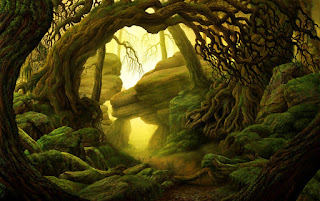 Concept Art by Marco Ferrera: Used here to illustrate the color discussion. The Shadow Tint: In an effort to have a more interesting composition, since I used a warm color for the light, I used a cool color for the shadow. I broke my rule above, and I think it shows that the gray is a just a little bit too bright in the shadow. There is a drop of blue mixed with a drop of the light/medium gray that I used. for the rock. The burnt umber washes darkened the rock, so the highlight in shade should have been a little darker. One drop of burnt umber in the mix would have been better I think. Anyway, I'll make a follow up post with the details about the rocks, foliage, and other bits. |
|
caveman
Paint Manipulator
Posts: 107
|
Post by caveman on Jul 15, 2013 10:40:58 GMT -5
I don't know if those are supposed to be "proof of concept" tiles or what, but they look like one heck of a fantastic finished product to me. My eye read what was going on immediately, and the "upper depths" of that forest were communicated with crystal clarity. Those sunlit spots contrasted with the shadows made it completely apparent that there was as much height to each of the trees as there was width and breadth of the forest itself. What I'm trying to say is that this truly excellent paint job of yours gives tangible substance to the illusion of being submerged in a very deep forest.
Outstanding job, and thank you very much for the "how to".
|
|
caveman
Paint Manipulator
Posts: 107
|
Post by caveman on Jul 15, 2013 10:42:04 GMT -5
And now I'm wondering what a MOONLIT version would look like. (Drool drool)
|
|
|
|
Post by ashrothedm on Jul 15, 2013 11:31:20 GMT -5
I'll describe the other bits used to make the tiles here. Nothing used came from any type of terrain studio. (That's probably apparent) Everything used can be found at a hardware store or big box store. The pink foam insulation is the most exotic item. Here is the image that I'll reference:  General Order of Operations for Adding the Details: General Order of Operations for Adding the Details:- Prepare cardboard shape/size
- Add the trees and roots.
- Base coat black
- Base coat with the brown texture paint.
- Add the big rocks and shrubs
- Add small rocks and
- Painting the grass with a sponge.
- Paint the rocks/foliage
- Drop the shadow
- Add the highlights (dry brushing the light onto the open areas as well)
Trees:The tree stumps were fairly simple, and I think everyone has seen the technique before. I used dowel rods from 3/8" to 3/4" in diameter. - cut off a 1-2 cm disc from the dowel rod
- Glue it to the tile (before painting the tile.)
- Add bits of hot glue, dragging out from the trunk, to make roots.
- Base and paint the tile
- Painting: I think I should do it differently so I'll stop there.
Shrub #1:The purple bits are chunks of sponge. I was going to use them as kind of an exotic bush, letting some purple show, but I need to experiment with the sponge a little bit before I try that. I also think I should have gotten them wet before I used them. Ideally, soaked in a black wash before applying them to the board. This is the least fancy process. The sponge can really be any color, and if it were soaked in a black wash first, I think the color would just hint from the sponge. - Tear off little bits of household sponge
- Glue them to the tile
- Painted black
- Painted green
- Highlighted as above
Shrub #2:The green shrubs were made from scouring pads. These had a nice green color to begin with, which is fortunate, because they were the hardest to recolor. Getting the paint into the shrub requires a lot of watering down. The scouring pad I'm referring to is the rough dark green pads that you can sort of see through.  - Cut 7 mm strips of the scouring pad.
- Peel the scouring pad apart, like you're trying to peel one layer of corrugation off of cardboard. You'll end up with 2 jagged 7 cm wide strips of sponge
- tear or cut into tiny chunks and set aside
- Apply a spot of hot glue to the tile and lightly press a few chunks of scouring pad into it. You don't need or want a lot of glue. Too much glue will fill up the openings in the sponge and flatten it out. (Watch your fingers or you'll end up saying some magic words. I'm pretty sure I cast a 9th level spell on one of those shrubs.)
- Add more bits as desired to build up the shrub. Most of mine were single layers, but a few needed to be propped up.
- Apply diluted black paint to them. (Each little section had this all done at the same time.)
- Paint to the preferred color
- Apply highlights and shadows as discussed above.
Small Rock Gravel:This one is simple and I know DM Scotty has shown it: Construction sand, aquarium sand, some kind of sand, a little bit rough. That's all it is. Simple process. - Apply White glue
- Cover glue with sand
- Let it dry, shake off excess onto some paper so that you can put the leftovers back in their container.
- Paint it. (Will describe painting rocks in detail in the next section)
The Big Boulders:These are the most complicated of the terrain bits used in these tiles. They also have a slightly different method of painting that I'm not sure if it has been covered or not. TerranScapes on youtube talks about his painting methods, and I highly recommend watching his videos for some cool terrain ideas or techniques. (Very in depth looks at work and work in progress, as well as products etc.) His work, although beautiful, doesn't seem cheap, and is very much not 2.5D. In any case, back to the point, the rocks and mountains that he does are very interesting. I'm going to list what I did based on his work. The rocks are carved from pink insulation foam. I know the lights really washed out the color in the picture, but I assure you, they were pink foam rocks. Before you carve them, have a look at some images of rocks, and find the kind you want to use on the tile. These were large granite boulders, so I used images of granite boulders for reference. Rocks can look very different, so it's kind of an important step here. If you were carving shale or sandstone, it would be very different. So, here is what I did, with an additional step that I skipped but would have improved the rock look: - Cut out a small chunk of pink foam insulation
- use a craft knife and make an incision cutting partially through, then, put pressure on the foam (pressing it into the blade) and rotate the knife, snapping off the remainder of the cut. Imagine that you are taking a square and cutting the corners off to make an octagon. Except, don't make a perfect octagon, there is only one rock that I know of that has that shape.
- Make all of your cuts irregular, constantly cutting off corners, or changing the angles of the rock. Add fissure, etc. (It's very difficult to write what you should do.) Partial cut and snap, until there is no original outer layer showing. If there is an outer layer, keep going. (The outer layer does not take paint like the exposed foam does.
- if the rock sucks, cut it in half, you may be able to use it for a smaller rock. I did this a few times.
- Save all of the scrap in a container. Those extra bits can be turned into rock flocking (as soon as I find a less tedious method to do it, I will probably post that too.)
- Put some hot glue on the tile and press the fully carved rock onto it. (I placed the rocks first.) If you use a lot of glue, you'll melt the foam. Just put enough to make it stick, and remember, the foliage near it will also use some hot glue, so don't melt the entire thing away.
- Get a stiff brush, and cut the bristles down to little 7 cm stubs. (an old brush, toothbrush, something)
- Stipple the exterior of the foam, adding a ton of little imperfections into the shape.
- Paint it black for the base coat.
- Paint the rock a medium gray color
- For these granite blocks, I used Burnt Umber and watered it down. Water it down a lot. You're going to wash over the gray rock several times. Feel free to mix wash colors. Pick earth tones and wash repeatedly. These were entirely washed with burnt umber. (3-4 washes)
- Add the forest tile shadows.
- The rock will look cool, but you really are going to want to add that highlight layer.
- Pick your two highlights as described above. I used a golden yellow for the light highlight, and a shale sort of blue/gray for the shadow highlight
- Dry brush the highlight colors onto the appropriate parts. Light in the light, and the shadow in the shadow.
- Stare at the rocks and ponder how cool they look. (I really did this several times, looking for what I liked and did not like about their color and shape.)
This is a long post about what I did, and I think I have it all in there. As I mentioned, I am certain that there are more details and bits that could be added. Feel free to post changes, additions, comments, etc. I think this process leaves a pretty and playable tile, with all of the depth of a forest encounter, and so far, it feels like a lot less of the hassle of having big trees in the way. I want to keep refining the outdoor encounter! Modularity in the tile set: I mentioned above, that the edges are wither in light, or in shadow, broken up in 6.5 cm sections. Given the limited number of Tiles I've made, it's hard to see that, but I assure you, with enough pieces made, you can arrange them in a number of ways. One thing I wanted to show was that even with the 6.5 cm constraint on light and shadow breaks, the shape within can be any irregular shape. The forest is not square, and the lining up of light and shadow will help transition from inside to outside of the forest. More tiles will mean more of an ability to show how they can be reused. I'll probably continue making sections trying to branch them off of the special places like the clearing or the entrance to the clearing tiles (on the left side). Oh, one last note: I'm aiming for a modular tile that can be shuffled around, but this would completely work with an irregular shape. Just like DM Scotty's video on forest sections (DM's Craft 11), you could do this instead of adding the tall trees. |
|
|
|
Post by ashrothedm on Jul 15, 2013 11:37:13 GMT -5
Thanks Caveman (and dmg and everyone else above), that follow up post of mine was gradually being worked on while I'm working... so... it took a while to get it posted.
As for moonlit tiles, absolutely. Haunted forests, dark and eerie forests, Fey woods, all sorts of mood can be set with the color on the tiles. The first test here was to go for a neutral/common forest, just to see if the technique would keep the tile flat and whatnot. A set of normal wilderness tiles and a transition piece to the specials should work well.
I would think, at a minimum, you need an "Out of the forest tile", "Edge of the forest tile" (transition), and "In the forest tile". Or one massive piece that does it all. I like the idea of reusing it, so breaking it up is the way I approached it.
|
|
|
|
Post by ashrothedm on Jul 15, 2013 12:52:46 GMT -5
Another thing I didn't comment on above: dmg's 3x3 road curve: Absolutely. Using a wider turn that's more irregular will help bridge the gap between tiles. That's something I've been considering for my city tiles as well, but I have not really come up with a final solution for that. (which is odd, since my campaign revolves heavily around an urban setting)
My plan, is to use a similar tile structure, but I want the buildings to be 2.5, and I would prefer some nice roof layouts. And modular. That's another post though. Forests just kept gnawing at me and so, here we are.
For roads, I'm thinking I'll expose the brown texture paint and just flock the edges with stone and shrub. Most roads probably about 5 cm wide. Streams will be the same width, but probably more variation. Very large rivers will probably consist of river edges and water tiles separating the two banks.
|
|
thedmg
Room Planner
Posts: 327
|
Post by thedmg on Jul 16, 2013 5:27:39 GMT -5
No, thank YOU for that detailed breakdown.
|
|
|
|
Post by skunkape on Jul 16, 2013 13:38:05 GMT -5
Some interesting ideas for forest terrain there. Good implementation!
|
|
|
|
Post by gnomezrule on Jul 16, 2013 20:43:57 GMT -5
WOW!
|
|
|
|
Post by bloodchoke on Jul 16, 2013 21:30:22 GMT -5
Man,I love those tiles! Thanks for the breakdown.
|
|
|
|
Post by ashrothedm on Jul 17, 2013 16:54:44 GMT -5
Thank you everyone, I enjoy sharing the how-to.
I'm trying to work out the adventure details for these tiles (playing Saturday night) so my crafting is mostly on hold at the moment. I'll be revisiting this experiment for sure with other lighting, transition tiles, roads, etc. I started out aiming to make the trees playable, but I liked the other features so much, I might experiment with some of the specific areas in the campaign environment. (Homebrew)
Shadewood: A Dark Forest with some magical corruption/curse. Some exotic highlight color is in order.
Plaguemoss Ridge: Rolling mountains covered in a nasty green moss, littered with ruins of an ancient civilization. (A disease that is very bad for clerics as it causes a wisdom and charisma sapping disease called withering rot.)
I think that even with a few "you're in this forest environment" tiles, changing the orientation or other placeable features on it will be enough to keep the tiles fresh and interesting. Even a single "campsite" tile would probably not get old very quickly.
|
|
thedmg
Room Planner
Posts: 327
|
Post by thedmg on Jul 17, 2013 17:29:19 GMT -5
Just a clearing so you can place campsites, dungeon entrances, stone circles, etc etc etc. Make the other pieces removable so you can change the orientation. Far less crafting.
|
|
|
|
Post by ashrothedm on Jul 17, 2013 22:43:32 GMT -5
To some extent, that will be the plan, and certainly some removable campfires will be in the mix, but there is a little something exciting (to me at least) about casting the shadows out of the center of the camp, making those dark areas even darker behind the trees.
The campfire is a bit of an exception piece for me. It's kind of an iconic adventuring party image that comes up often enough to deserve one of the extra effort tiles. A little campfire, some trees to nestle into, places to keep watch, surrounded by that eerie illumination that kids tell ghost stories by. From an adventurer's perspective, the deep dark dangerous forest lies beyond the safety of that little campfire, so making that tile feel like the last cozy ounce of space will elevate the sense of fear and dread.
Hitchcock always said that you should start a suspenseful film off in the bright daylight. A cozy and comfortable life that your characters are at risk of losing is much more compelling, motivating, and something the audience (or PCs) can identify with.
That's my logic behind that piece at least.
|
|


 . I have been busy on my cave tile system and have not gone to wilderness yet.


